
For decades, logos were the cornerstone of brand identity. They were meticulously crafted, heavily protected, and instantly recognizable. But today, something fascinating is happening — logos are slowly taking a backseat, and colour is stepping into the spotlight.
In a world dominated by scrolling, swiping, and shrinking attention spans, brands are realizing one thing:
👉 Recognition needs to be instant.
And nothing communicates faster than colour.
The Shift From Logos to Colour Memory
Think about your daily digital experience.
You’re scrolling quickly. Ads flash by. Apps compete for milliseconds of attention.
In that chaos, do you always read a logo?
Not really.
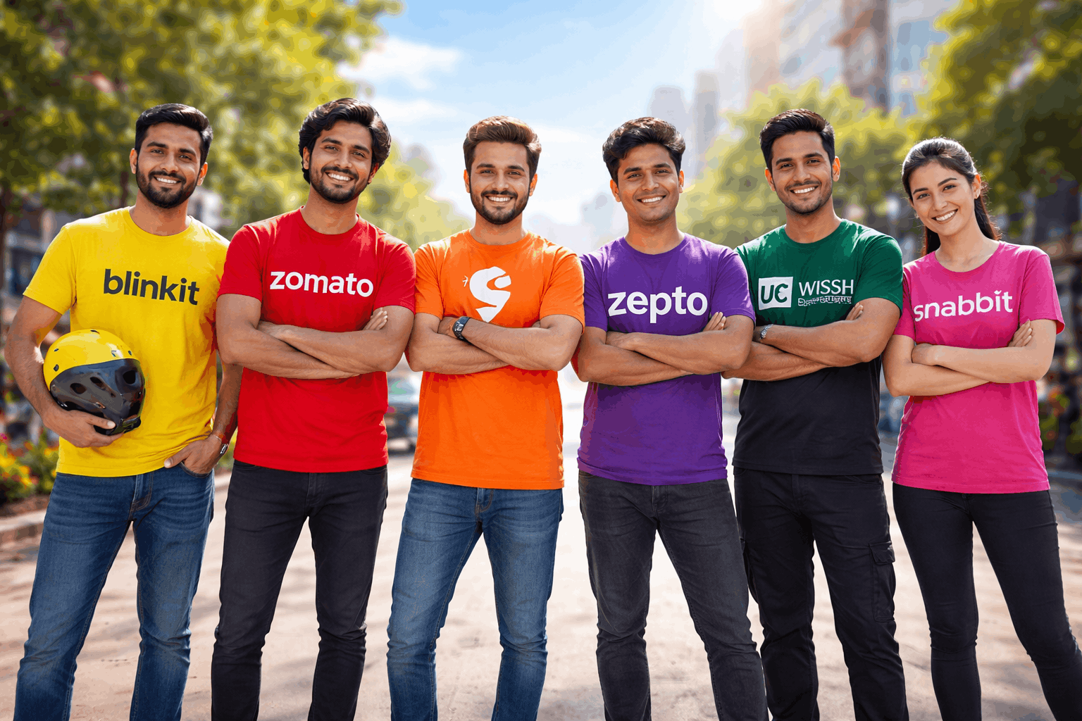
Instead, your brain recognizes patterns instantly:
- 🟡 Yellow → Blinkit
- 🔴 Red → Zomato
- 🟠 Orange → Swiggy
- 🟣 Purple → Zepto
- 🟢 Green → Swish
You don’t need to read.
You don’t need to think.
You just know.
This is colour-first branding — and it’s changing the game.
Why Colour Works Faster Than Logos
1. Instant Cognitive Processing
The human brain processes colour faster than shapes or text.
Logos require interpretation:
- Identify shape
- Read typography
- Recall meaning
Colour skips all that.
It’s processed almost instinctively, making it ideal for fast-paced environments like social media, outdoor ads, and mobile apps.
2. Designed for the Scroll Economy
We are living in what can be called the “scroll economy.”
Users:
- Spend seconds (or less) on content
- Make decisions quickly
- Ignore anything that feels complex
Colour stands out instantly in this environment.
A bold, consistent colour palette can stop a scroll faster than a detailed logo.
3. Strong Emotional Triggers
Colour is deeply tied to psychology:
- 🔴 Red → urgency, hunger, excitement
- 🟡 Yellow → speed, energy, optimism
- 🟢 Green → freshness, trust, growth
- 🟣 Purple → innovation, premium feel
Brands are no longer just choosing colours for aesthetics —
They are choosing them for emotional impact and positioning.
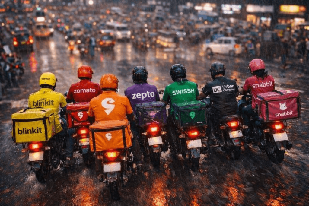
4. Visibility in Real-World Chaos
Think beyond screens.
In real life:
- Delivery riders move fast
- Billboards compete for attention
- Packaging sits among dozens of competitors
In such environments, simple, bold colour blocks outperform complex logos.
From a distance or in motion, colour wins every time.
Case Study Quick Commerce Brands
The quick commerce industry perfectly demonstrates this shift.
All players offer similar services:
- Fast delivery
- Grocery convenience
- Mobile-first experience
So how do they stand out?
👉 Through distinct colour ownership.
Each brand has claimed a colour space:
- Blinkit owns yellow speed
- Zomato dominates red urgency
- Swiggy captures orange energy
- Zepto stands out with purple uniqueness
This creates:
- Instant differentiation
- Strong recall
- Category clarity
Even without logos, users can identify the brand.
From Detail to Instinct
Traditional branding relied on detail recognition:
- Logo design
- Typography
- Symbolism
Modern branding is shifting toward instinct recognition:
- Colour
- Motion
- Simplicity
This is a huge mindset shift.
Instead of asking:
👉 “Can people recognize our logo?”
Brands now ask:
👉 “Can people recognize us instantly?”
The Role of Minimalism in Modern Branding
Minimalism is not just a design trend — it’s a strategic necessity.
Why?
Because:
- Less detail = faster processing
- Simpler visuals = better recall
- Cleaner identity = stronger impact
Colour-first branding fits perfectly into this approach.
A single strong colour can:
- Replace complex elements
- Unify brand communication
- Create consistency across platforms
Digital Platforms Are Driving This Change
The rise of mobile-first platforms has accelerated this shift.
On small screens:
- Logos appear tiny
- Details get lost
- Typography becomes unreadable
But colour?
👉 It remains powerful, visible, and unmistakable.
Whether it’s an app icon, notification, or ad banner —
colour is what stands out first.
Is Logo Branding Dead?
Not at all.
Logos still matter. They:
- Anchor brand identity
- Provide credibility
- Offer structure
But their role is evolving.
Instead of being the primary identifier,
logos are becoming supporting elements.
Colour, on the other hand, is becoming the frontline communicator.
The Future of Branding
Looking ahead, we can expect:
1. Colour Ownership Will Intensify
Brands will fight to “own” specific colours within categories.
2. Simpler Brand Systems
Less clutter, more clarity.
3. Multi-Sensory Branding
Colour + motion + sound = faster recognition.
4. Speed-First Design Thinking
Design decisions will prioritize:
- Speed
- Clarity
- Instant recall
What This Means for Designers & Brands
If you’re a designer, marketer, or business owner — this shift is critical.
You need to start thinking:
- ❓ Does your brand have a distinct colour identity?
- ❓ Is your colour consistent across all platforms?
- ❓ Can people recognize your brand without seeing your logo?
If the answer is no —
you’re already behind.
Conclusion
We’re entering an era where:
👉 Attention is limited
👉 Speed is everything
👉 Simplicity wins
In this environment, branding must evolve.
The future isn’t just about being creative.
It’s about being instantly recognizable.
Because in today’s world:
If your brand isn’t identified in seconds, it’s ignored in milliseconds.