
Colors are more than just design elements — they are powerful psychological triggers that shape how people perceive, remember, and connect with your brand. The right color choice can make your brand feel trustworthy, energetic, luxurious, or playful — while the wrong one can confuse your audience or send the wrong message.
At Picassomultimedia, we believe that selecting the right color palette is a crucial step in building a strong brand identity. This guide will help you understand which color suits which type of brand and why.
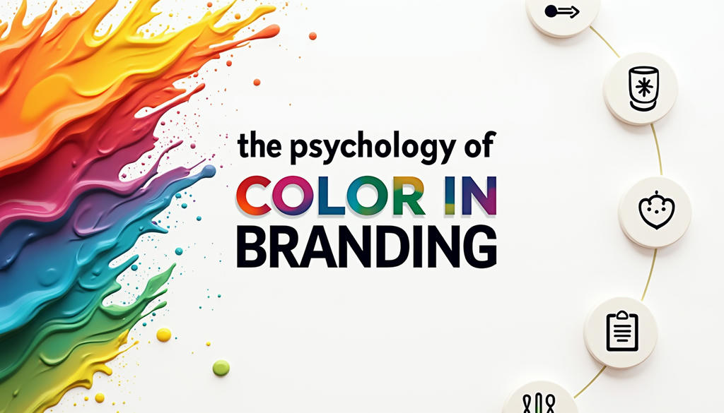
Why Colors Matter in Branding
Research shows that up to 90% of first impressions about a product can be based on color alone. Colors affect emotions, influence buying behavior, and even determine whether a customer will remember your brand later.
That’s why top companies — from Coca-Cola’s red to Facebook’s blue — are so consistent with their color usage. It’s not just about looking good; it’s about owning a psychological space in your customer’s mind.
The Psychology of Colors in Branding
Here’s a breakdown of major colors and which types of brands they are best suited for:
🔴 Red – Energy, Passion, Urgency
- Best For: Food & beverage, retail, entertainment, sports.
- Examples: Coca-Cola, Netflix, YouTube.
- Why Use It: Red grabs attention, stimulates appetite, and creates excitement. Perfect for brands that want to appear bold and action-oriented.
🔵 Blue – Trust, Reliability, Calmness
- Best For: Technology, finance, healthcare, corporate businesses.
- Examples: Facebook, PayPal, IBM.
- Why Use It: Blue builds trust and conveys professionalism. Great for brands that deal with sensitive data, money, or health.
🟢 Green – Growth, Nature, Freshness
- Best For: Sustainability, wellness, health foods, eco-friendly brands.
- Examples: Starbucks, Whole Foods, Spotify.
- Why Use It: Green suggests natural growth, health, and harmony. Ideal for brands that promote well-being or environmental responsibility.
🟡 Yellow – Optimism, Positivity, Warmth
- Best For: Child-focused brands, travel, lifestyle, casual retail.
- Examples: McDonald’s (with red), IKEA, Snapchat.
- Why Use It: Yellow is cheerful and attention-grabbing, perfect for brands that want to evoke happiness and friendliness.
⚫ Black – Luxury, Sophistication, Power
- Best For: High-end fashion, luxury goods, tech products.
- Examples: Chanel, Apple, Nike.
- Why Use It: Black is sleek and timeless. It signals exclusivity and premium quality.
🟠 Orange – Creativity, Fun, Enthusiasm
- Best For: Startups, creative agencies, casual brands, entertainment.
- Examples: Fanta, SoundCloud, Harley-Davidson.
- Why Use It: Orange strikes a balance between playful and bold, great for brands that want to be approachable yet energetic.
🟣 Purple – Creativity, Wisdom, Royalty
- Best For: Beauty, luxury, spirituality, tech innovation.
- Examples: Yahoo, Cadbury, Twitch.
- Why Use It: Purple blends stability (blue) and energy (red) to create a sense of mystery and premium value.
Tips for Choosing the Right Brand Color
At Picassomultimedia, we recommend using a strategic approach when selecting colors for your brand:
- Know Your Audience – What emotions do you want to trigger in them?
- Analyze Your Competitors – You want to stand out, not blend in.
- Consider Industry Standards – Some industries have dominant colors (blue for tech, green for eco-brands).
- Limit Your Palette – Use 1-2 primary colors and 2-3 supporting shades for a clean, consistent look.
- Test & Get Feedback – See how your audience responds before finalizing your choice.
How Picassomultimedia Helps You Pick the Perfect Palette
Our branding experts create custom color strategies that go beyond aesthetics. We consider:
- Your brand personality and values.
- Your target audience’s psychological response.
- Practicality for digital, print, and merchandise usage.
- Accessibility and readability across all devices.
With a clear brand color guideline, we ensure consistency across your website, social media, ads, and all marketing materials.
Final Thoughts
Choosing the right color is not just a design decision — it’s a strategic business choice. The right palette can increase recognition, build trust, and improve emotional connection with your audience.
At Picassomultimedia, we help brands decode color psychology and create a visual identity that truly represents their values and vision.